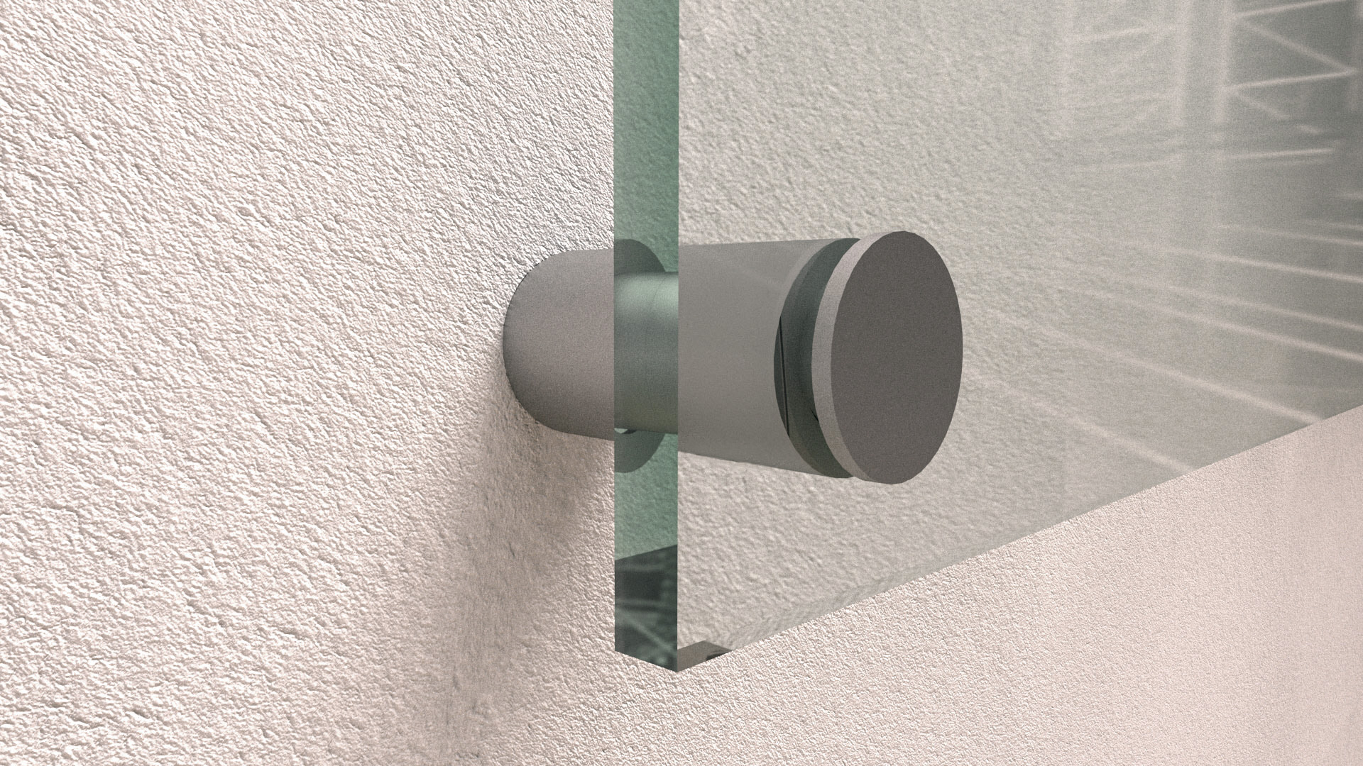
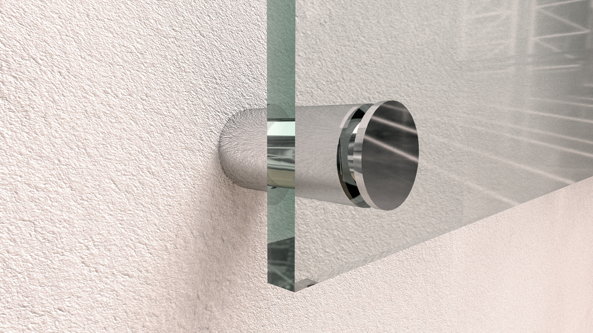

A standoff spacer holds a sign a few centimetres off the wall. That gap is not decoration — it puts the sign in its own shadow, which is what makes lettering read cleanly against a busy wall.
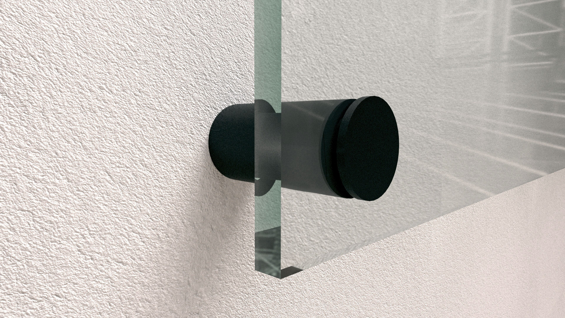
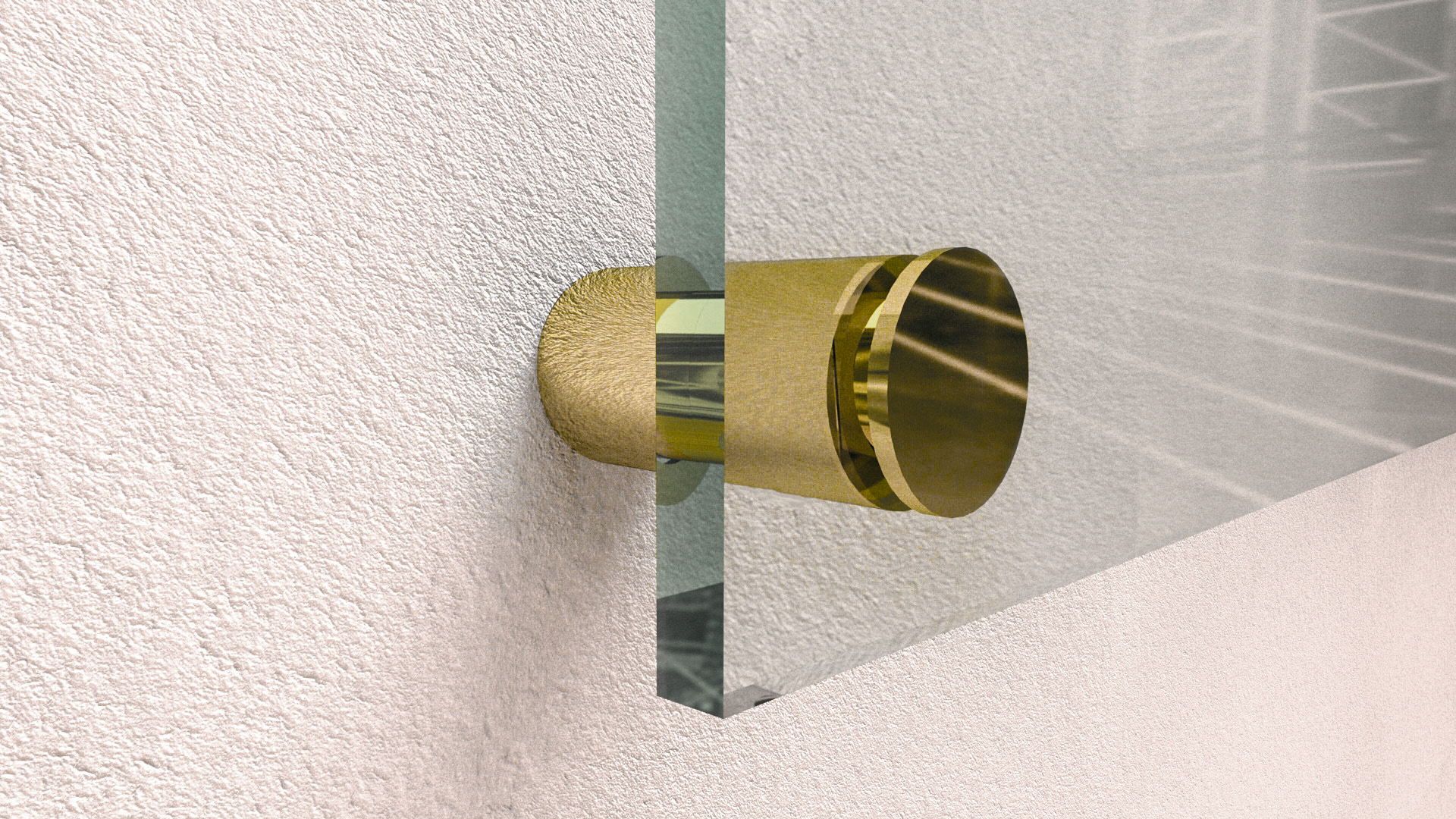
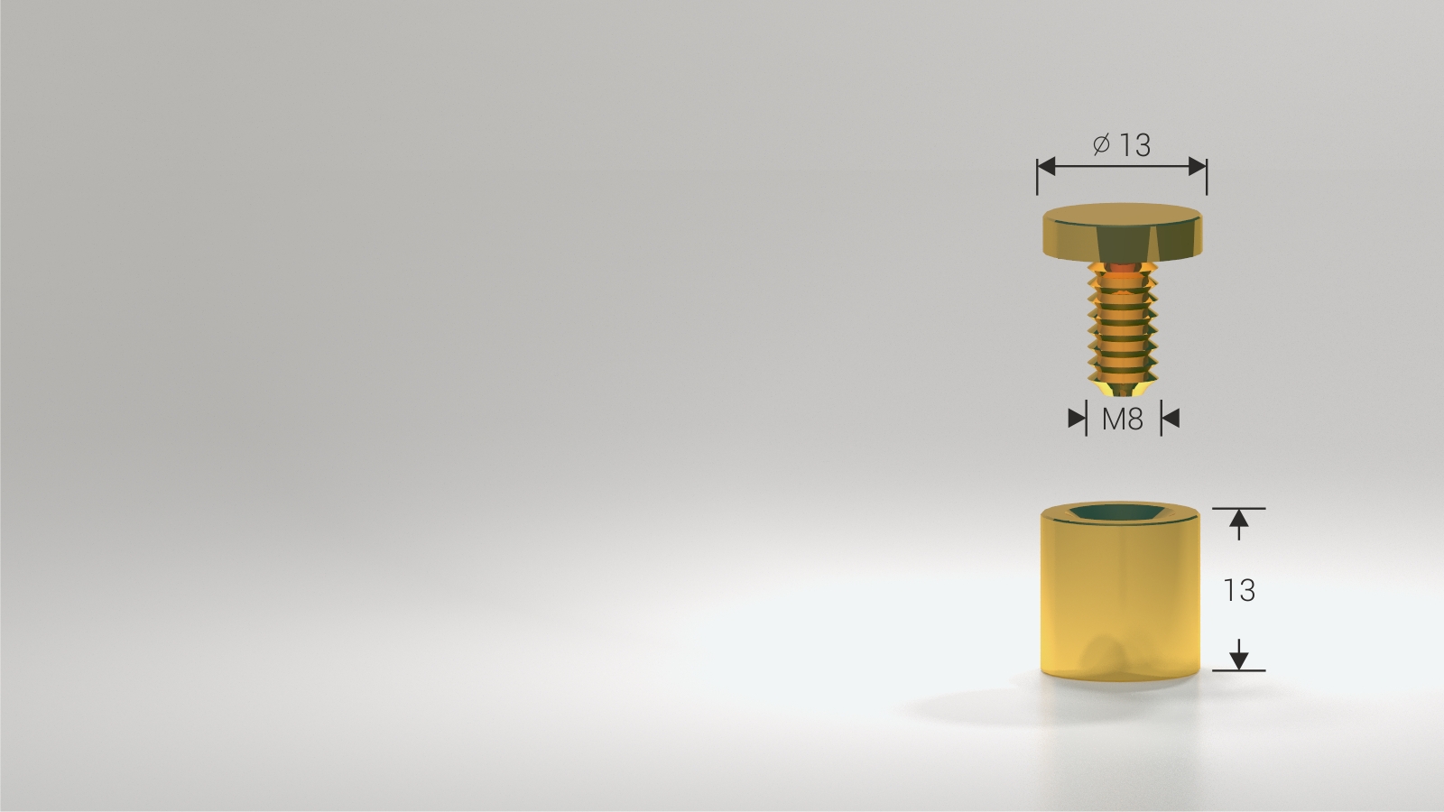
Four finishes, and the rule is to match the ironmongery already in the room rather than the sign itself. Satin aluminium is the neutral default and goes unnoticed against most walls. Black aluminium disappears on dark surfaces and on black panels, where a bright cap would pull the eye to the fixing instead of the text. Brass chrome and brass polished gold read as formal and belong in hospitality, legal and hotel interiors — gold in particular is a decision about the building, not about the sign.
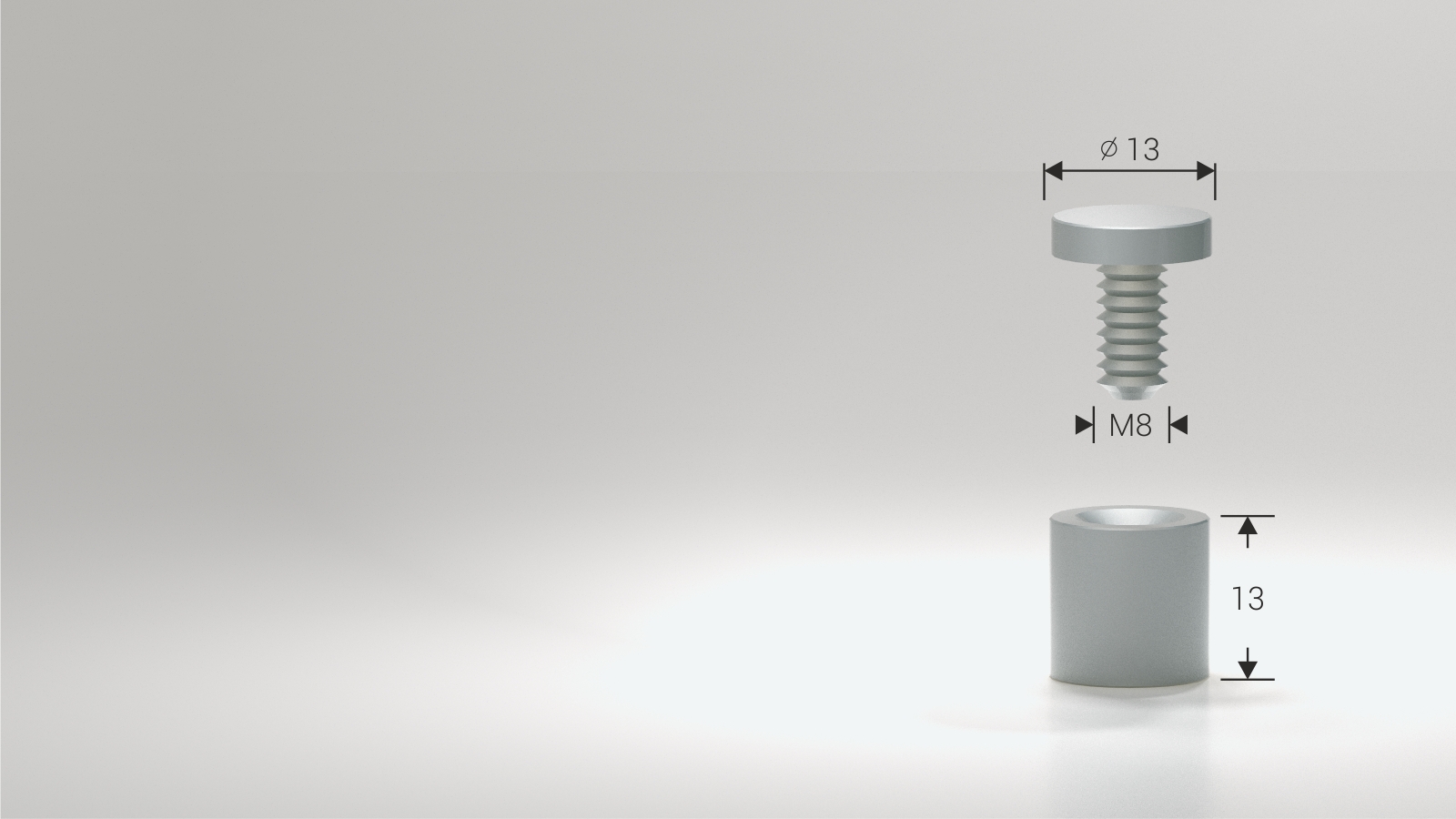
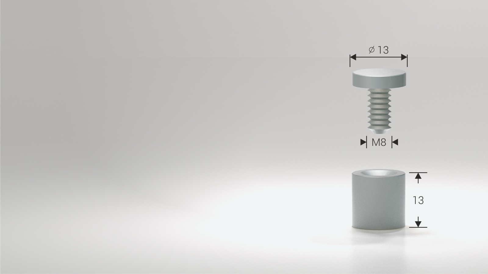
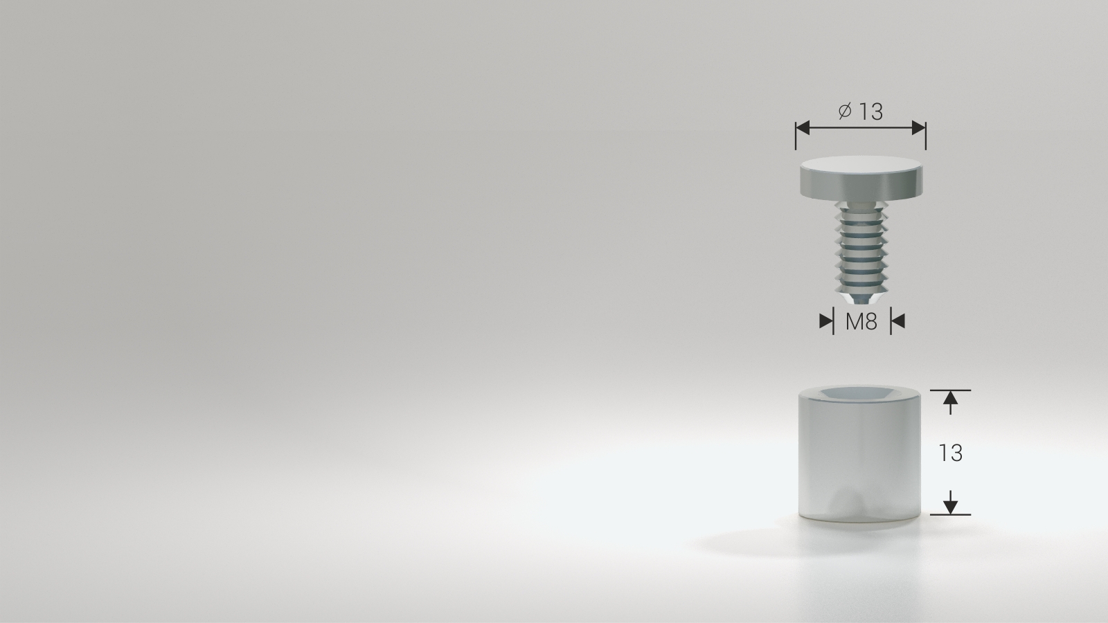
Sizes are given as diameter by length, from 13×13 up to 25×25, with 13×40 as the long option. Diameter follows panel weight: 13 mm for light acrylic and small plates, 19 to 25 mm for glass and larger panels. Length sets the size of the shadow gap. A short spacer keeps the panel tight to the wall and stays discreet; 13×40 pushes it well clear, which is what a textured or brick wall needs, because a close-mounted panel picks up every irregularity behind it. Keep diameter and length in proportion — a wide cap on a long barrel looks industrial, a narrow one under a heavy panel looks under-built.
Spacers are made of aluminium, brass or stainless steel and they are visible from the front, so they are part of the design and should sit on a grid rather than wherever the drilling was convenient. Four is the usual count on a panel, more on glass and on anything wide enough to bow in the middle. Drill the panel before the wall: the panel is the part that cannot be re-drilled.
Other products in Hardware, Stands and Mounting: ARCH Stand Shelves and TV Brackets, Stainless Steel Sign Spacers with Lock, Fabric Wall Accessories and Spares and Decorative Screw Covers. More in this group: Hardware, Stands and Mounting. Or the whole Display Systems range.
It holds a glass or acrylic panel a few centimetres off the wall. That gap puts the sign in its own shadow, which is what makes lettering read cleanly against a busy or textured wall.
By panel weight, not by taste. 13 mm for light acrylic and small plates; 19 to 25 mm for glass and larger panels. Undersized spacers on a heavy panel is the failure everyone discovers late.
Match the ironmongery already in the room. Satin aluminium is the neutral default, black disappears on dark walls, chrome and polished gold read as formal and suit hospitality and legal interiors.
With a standard spacer, yes. If that is a problem — a school, a public building, anything at eye level — use the locking version with a grub screw.
| Finish | Satin aluminium, Black aluminium, Brass chrome, Brass polished gold |
|---|---|
| Size | 25×25, 25×19, 19×25, 19×19, 15×25, 15×20, 13×25, 13×19, 13×13, 13×40 |
| Material | satin aluminum |

Our EU-based production means we meet even the tightest event deadlines.

Each product is created specifically to meet your unique event needs and brand guidelines.

Recycled aluminium, FSC wood and reusable frames — sustainable options across the range.








Our projects